The Apprentice logo challenge - s18 ep3
19th February 2024
posted 19th February 2024
It’s our favourite time of year again, The Apprentice is back! In 2022, we took on the challenge of redesigning the logos from The Apprentice series 16. Our design team loved this challenge, so we decided to do it again.
In this blog, we'll look at the logos from The Apprentice Series 18, episode 3. We'll analyse both team’s logos, giving our opinion on their designs and choices. We understand that designing under pressure to a short time scale isn’t easy, so we'll be taking on the challenge of redesigning their logos in a similarly short time.
The Task
This week's challenge was to create a virtual escape room game. Both teams had to create, design, and brand a virtual reality game to pitch to big investors. The games needed a theme, a main character, and a puzzling escape story. The team that received the biggest investment were the crowned winners.
In the first two episodes of the series, the girls team triumphed. So, to shake things up a little, the teams were shuffled into mixed-gender groups.
Team Nexus – Medieval Escape
The first team coined themselves ‘Nexus’, meaning a connection or link between things. Their concept idea was a Medieval-themed escape room. In the game, the people of the village are struck down by the plague. As a player, you need to complete a series of puzzles to find ingredients for a potion that will cure them.
When it came to creating the game, the visual side looked good. However, the game story itself was a little on the boring side and quite basic. This was also reflected in the logo design.
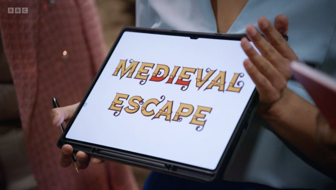
For the logo design, they chose a decorative style font with a nod to medieval stylings. They paired this with a gold colour and hints of blood red. Instead of any icons, they chose to add some design detail within the text.
We’ve certainly seen worse on The Apprentice, such as the infamous Seaquility logo in season 16 ep 1. So, in comparison to previous designs, this isn’t that bad. However, they have played it too safely, resulting in a very basic design.
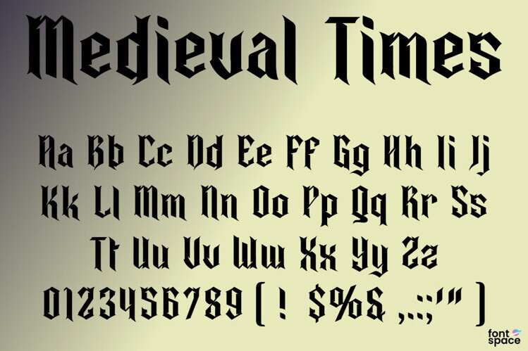
Text – Focusing on the text, they’ve used a decorative-style font. Decorative-style fonts are fonts that are different to the norm. These fonts tend to have decorative elements and a unique design to them. This makes a decorative-style font a great choice for games, as they add personality to a design. In this instance, the font style type was the correct choice, but the actual font they chose didn’t quite hit the mark. The team were trying to create a stereotypical medieval theme to the logo. The font they chose isn’t representative of the Medieval era style. In Medieval times, fonts tended to be script-style fonts due to the tools they had available to them. Written scrolls and signs of the time were typically created using a quill. Although some would have decorative details, they wouldn’t look like the font chosen. Something like the font shown below would have enhanced the design.
Looking at the word spacing, the top and bottom words are too far apart. This makes the words look detached from each other. If the words were brought closer together it would help in making the design look more unified.
Colour – For the colours, the team chose a gold and red pairing. These colours are a good choice for a medieval logo. This shade of gold gives connotations of parchment paper, scrolls and sandy brick. The use of red gives connotations of the rich red fabrics, knights, and tournaments. All nods to the feel of medieval times.
Icon – The team chose not to use an icon for the logo, they chose to play with the text design. They added a subtle red marking to emphasise the word ‘Die’ within the text. The word 'Die' was emphasised as a nod to the plague theme of the game - the idea of this is clever. If it was combined with other decorative elements, it would have been more impactful.
In conclusion, there were some good choices made when trying to design the logo. By playing it safe, the logo seemed unfinished and a little cheap. If they had more time and pushed themselves, it could have been more refined. Having a text-based designed logo isn't a bad thing. There are some beautiful text logos out there, that don't look cheap and unfinished. When it comes to text-only logos, it’s all in the details, the spacing, and word placement that makes it look whole. This logo is a good example of how it doesn't quite work when those things are lacking. With the logo being for a game, some visual elements or icons would have helped make it more appealing.
Webfactory’s take on Medieval Escape
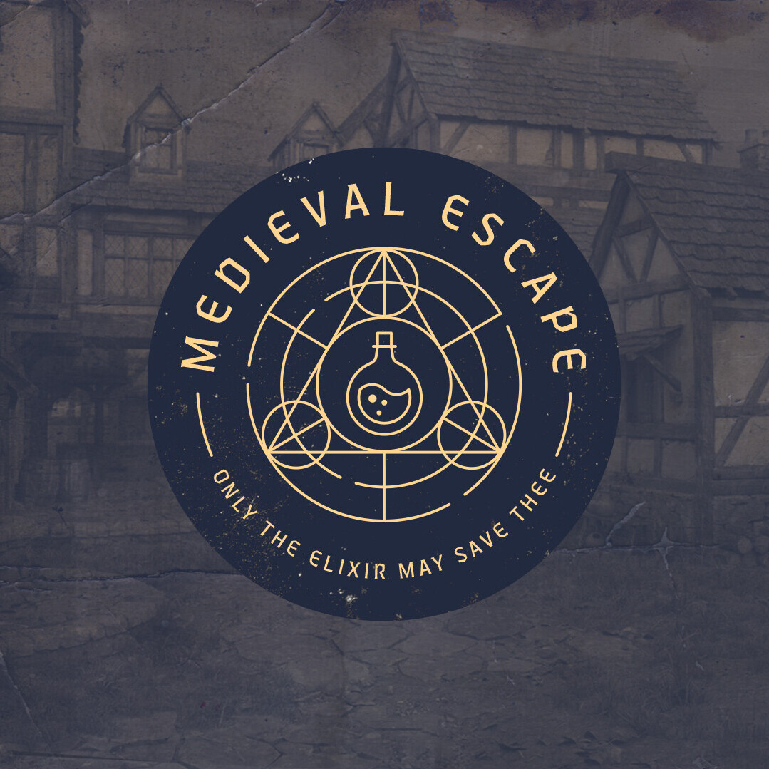
Image: Webfactory's take on Medieval Escape
For our quick take on the Medieval Escape logo, we’ve focused on the alchemy aspect of the game’s story. Alchemy is a chemical science popular in medieval times. It sought to transform invaluable metals into gold, cure diseases, and extend life with an 'elixir of life'. With the game seeking to source ingredients for a cure, the elixir is the design's main focal point. This highlights its importance to the gameplay.
'Blackletter' or script-style font are typically associated with the medieval period. However, this style of font is often difficult to read at a smaller size. Opting for a stylised sans-serif font gives a modern feel to the design while giving a nod to the style of 'Blackletter'. This allows the logo will be legible at any size, making it more appropriate for a logo design for an app game.
The icon is framed in the centre of the logo. It forms a "maze" shape around the elixir. The design of the maze draws inspiration from sacred geometry, which is frequently used in alchemical design. The geometric patterns also create compass-like arrows. This conveys a sense of exploration and travel that is required for discovering and solving puzzles in the game.
The logo colour scheme is gold and navy. Gold was considered a key material by alchemists. Using this as the primary logo colour emphasizes the significance of the elixir. The navy creates an effective contrast with the gold. The colour gives connotations to the game's darker themes of death and disease.
Team Supereem - Fallen Escape
The second team coined themselves ‘Supereem’, a combination of the words ‘Super’ and ‘Reem’. With the bonus of also sounding like the word supreme. Their game concept was a military-themed escape game. In the game, you’re in the military, and your helicopter has crash-landed on a deserted island. As a player, you need to find clues or puzzles that will lead you to various modes of transport to help you escape off the island.
The team lacked leadership and direction. When it came to creating the game and branding there was a lot of confusion. This was reflected in the designs for both the game and the logo.
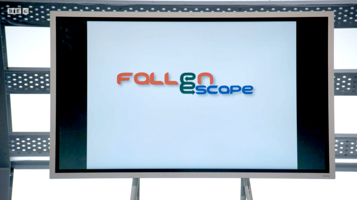
For the logo design, the team used a futuristic style sans serif font paired with a red and blue colour scheme. Then opted to add design details within the text instead of a standalone icon to represent a maze. Like with the Medieval Escape logo, we’ve certainly seen worse designs from past teams. Both teams tried to take the less is more approach to design. In this instance, it resulted in a bland logo that didn’t showcase the game well, if at all.
Text – For the logo text, they chose a stylised sans-serif font. The style of this font isn’t a good choice for this type of logo. The futuristic style gives connotations to space and technology rather than the military. When you think of the military, you think of strong bold fonts or stencilling. The roundness of the font gives a softness or a lightness to the logo. This is the opposite impression you would want to give to the armed forces. Blunt squared edges would have been more suitable. The text placement is a lot better on this logo. Both words look unified and part of the same logo.
Colour – The colours used for the logo are red and blue. The red and blue combination doesn't give connotations of the military or air force. Although the Royal Air Force is red, white and blue, the shades used are too light. This gives a bit of a disconnect between the logo and the game. In the episode, there were comments about the logo looking like a supermarket or a petrol station. I think the colour choice had a huge part to play in that assumption.
Icon - Instead of a stand-alone icon, the team added design detail to the text of the logo itself. They combined the ‘e’ from ‘Fallen’ and the ‘e’ from ‘Escape’ to create a maze symbol. The idea had potential, but the execution didn’t work well. When combing the two ‘e’s’, the line it creates doesn’t follow a path like a maze - there is no direct entrance or exit. This resulted in the icon being confusing and the legibility of the logo being poor.
In conclusion, the logo doesn’t represent a military-based game well. In isolation from the game, it could well be a logo for anything. They had thought a lot more about the placement of the text in this design and making it unified. They missed the mark by creating something a bit generic, boring, and unrelated to the gameplay.
Webfactory’s take on Fallen Escape
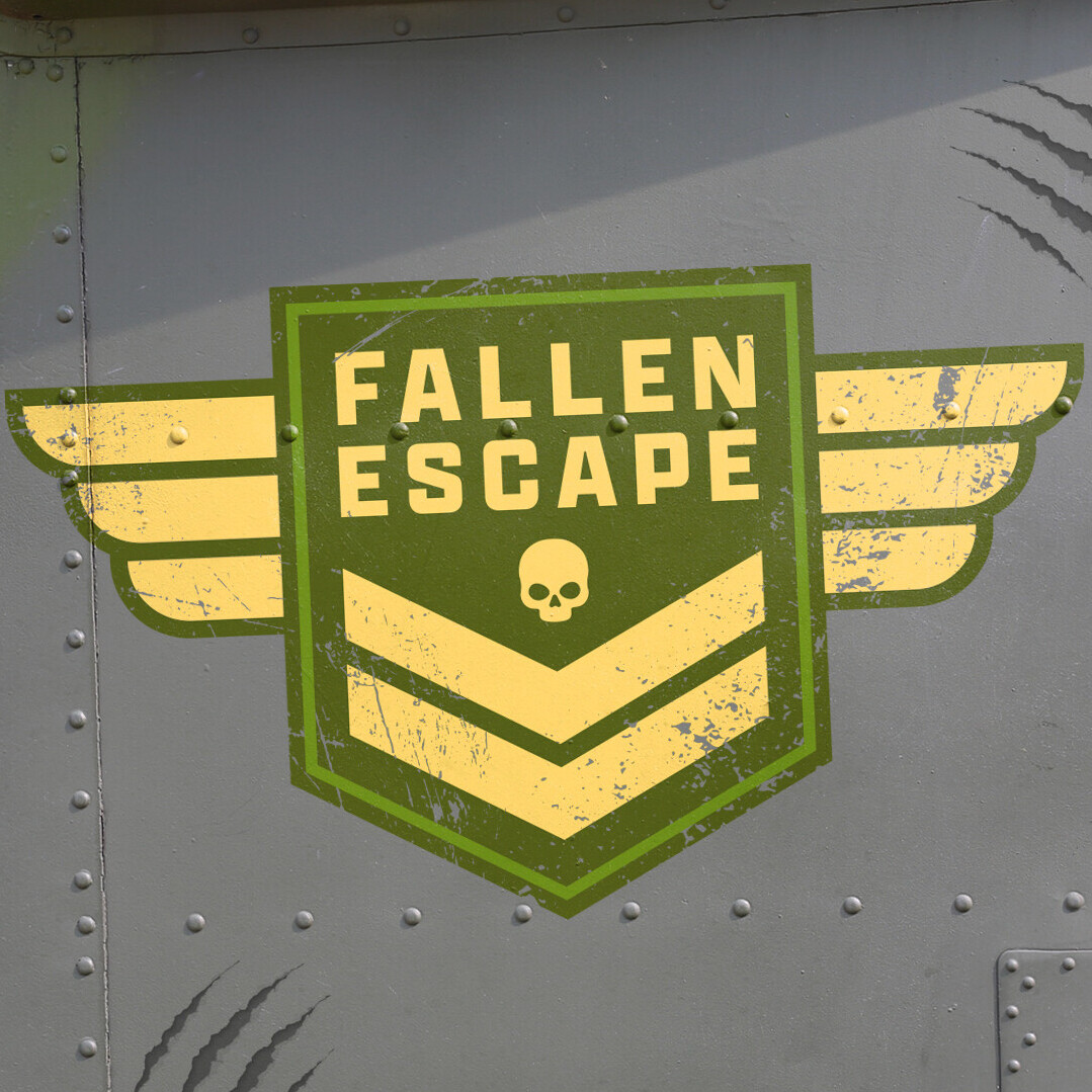
Image: Webfactory's take on Fallen Escape logo
For our quick take on Fallen Escape, we've focused on the military theme of the game. The logo concept is representative of a military badge or insignia. The logo has been overlayed on the side of a military vehicle. The distressed texture and claw mark a subtle, humorous nod to the now infamous bears in the gameplay. The wing shapes on the badge represent the aerial aspect of the game. The downward 'Rank' arrows suggest a fall or descent. The use of the small skull motif signifies the dangers that could be encountered during the game.
The colour scheme is inspired by combat uniforms. The sandy gold colour and shades of green also give note to the various locations that could be explored, such as forests and beaches.
When choosing a typeface, a typical military-style font was essential. The style is reminiscent of the "stencil" typefaces used on tools and containers. Using bold, uppercase characters gives a sense of danger and urgency. This style of font allows the logo to remain legible while also being eye-catching.
Learn more
To learn more about logo design and how to create the perfect logo for your business, check out our article here.
