The Apprentice logo challenge - s19 ep12 the final
22nd April 2025

posted 22nd April 2025
We made it to the final! On Thursday’s episode of The Apprentice 2025, Dean Franklin and Anisa Khan battled it out for the top spot. We’re a little behind due to the Easter bank holiday, but we’ve rounded up our design team for one last time to take on the challenge of re-designing the logos from the episode. You may be surprised by what we have to say about their designs.
In this blog, we’ll inspect the logos from The Apprentice Series 19 final and give our thoughts. Then we’ll take on the challenge with a quick redesign.
The Task
In the final, both candidates had to rebrand and pitch their businesses to a room full of industry experts. Their goal? To show they had the vision, plan, and passion to grow their business with Lord Sugar’s investment.
Dean Franklin – ‘Domesticool’
Dean Franklin runs an air conditioning business, offering heating and cooling systems for homes and businesses. His current company is called ‘ADL Air Conditioning’. For the rebrand, he chose the name ‘Domesticool’, a mix of domestic and cooling to highlight that most of his work, about 90%, is in people’s homes.
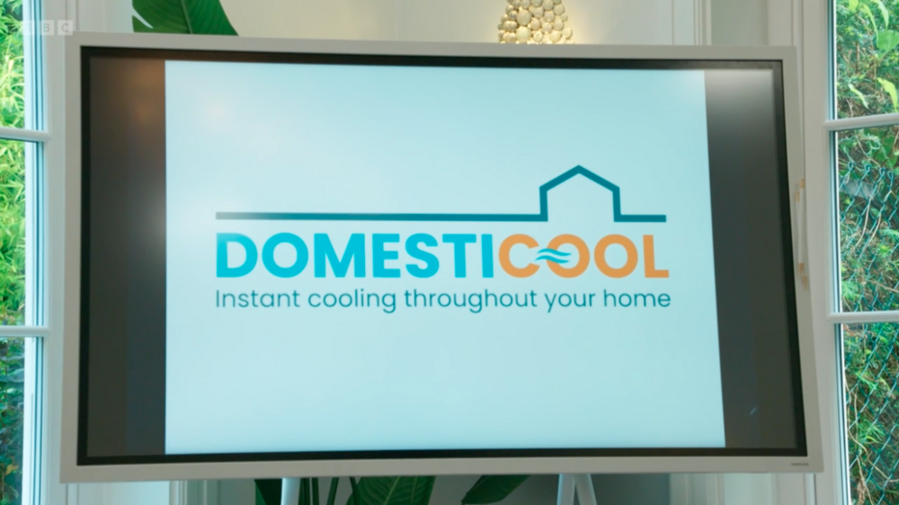
Image: Domesticool Logo design
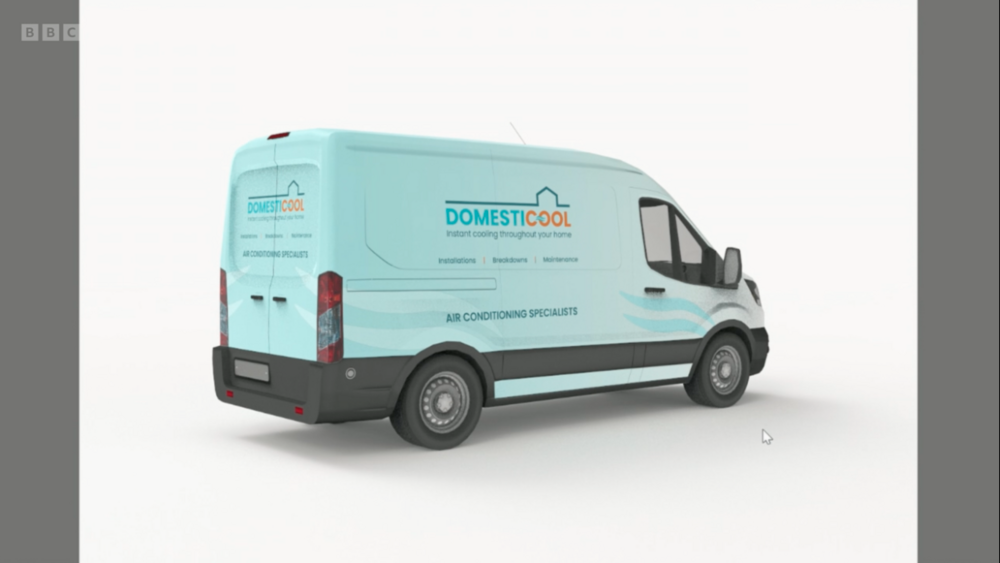
Image: Domesticool van design
Text: For the logo, he chose a bolder sans-serif font for the brand name and a regular sans-serif font for the tagline. It’s a smart choice; these fonts look modern, clean, and simple, which suits an air conditioning business. The font itself is clear and easy to read, making it accessible to all households. The bold text makes the name stand out and gives a sense of trust and confidence, which is ideal for a trade company.
Colour: For the colour scheme, he chose blue and red. The blue represents cooling, linking to water, ice, and cold air. Red stands for heating, with associations of warmth and fire. These colours reflect what the business does.
Icon: For the icons, he used a house and an air symbol. The house sits above the name in a line design, but it doesn’t look like a house as it’s missing details like a chimney and could be mistaken for a warehouse. The air icon is placed inside the text and works well as a subtle touch. Overall, the two icons together feel a bit busy. Using just one might have made the logo clearer. Sometimes, less is more.
Overall, the logo isn’t bad. It clearly shows what the business does, and you’d understand it right away if you saw it on a van. With some professional tweaks to make it look more polished, it has the potential to work well as a business logo.
Domesticool - Redesign
For our redesign of the Domesticool, we wanted to keep it cool.

Image: Domesticool logo redesign

Image: Domesticool van redesign
Icon: The icon has been designed with the intention of avoiding cliché icons, such as houses or snowflakes, to represent the ‘domestic’ and ‘cool’ components of the company name. Instead, a distinctive logo mark has been made that uses curved lines to form the letter "D." These lines symbolise the airflow from a conditioning unit. The small 'wave' icon in the middle has been retained as a subtle nod to the original logo.
Text: The original logo used a bold sans-serif font, which worked well for a strong, professional appearance. However, a different font has been used to better match the newly created icon, and a single colour has been used for a more versatile design. To avoid making the logo seem too serious, the icon's rounded edges also give it a sort, warm and approachable feel.
Colour: Dark navy colours have been chosen to show reliability and professionalism, which are both essential factors for a business that handles an important aspect of the customer’s daily life and home. The vivid blue accent colour was picked because it creates a striking contrast with the darker background colours and has a cool, icy appearance.
Anisa Khan - ‘Zaal’
Anisa Khan runs a food business called ‘Bombay Pizza’, which offers Indian-inspired pizzas. It’s a dark kitchen, meaning it’s delivery-only with no shop front. For the rebrand, she chose the name ‘Zaal’, which she explained means spicy in Bengali.
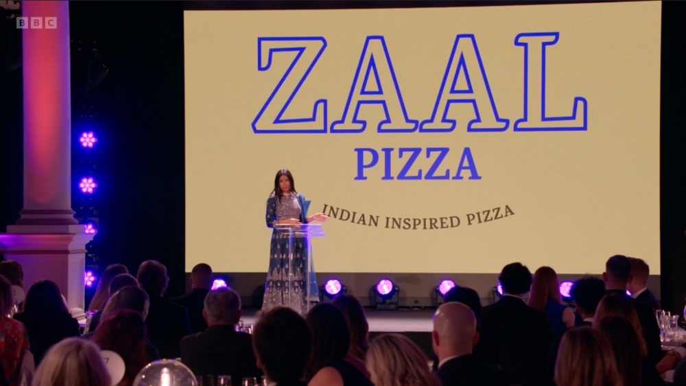
Image: Zaal logo design
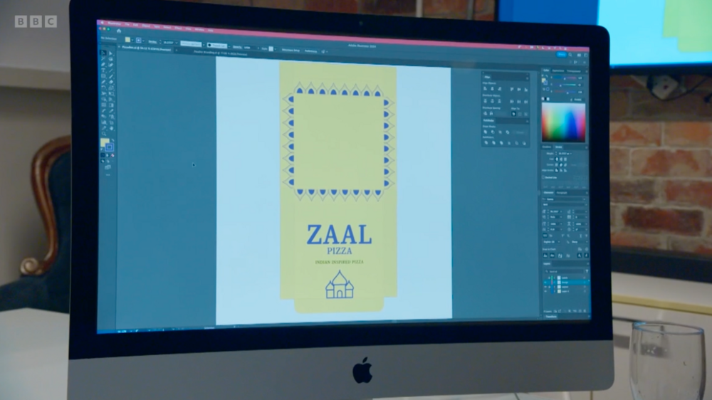
Image: Zaal pizza box
Text: For the text on the logo, she chose a serif font. Serif fonts feel traditional and trustworthy, which fits well with Indian food’s rich history. Paired with bright colours, it shows a mix of heritage and modern flair.
Colour: For the colour scheme, she chose yellow and purple. Yellow is a warm, joyful colour linked to food, sunlight, turmeric, and celebrations in Indian culture. Purple is a rich, luxurious colour often seen in temple art in India. Both colours are bold and have strong cultural significance.
Icon: She chose not to use icons in the logo, which is common in logo design. However, for the box, she added traditional patterns and a Taj Mahal icon to better communicate the message, as the team felt the logo alone wasn't enough.
Overall, the design is visually appealing. However, adding an icon could have made the logo’s message clearer. The pizza box did a better job of communicating the business than the logo by itself.
Zaal - Redesign
For our redesign of Zaal, we wanted to give it more punch!
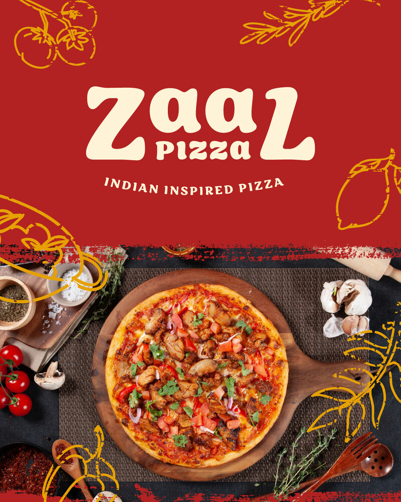
Image: Zaal logo redesign
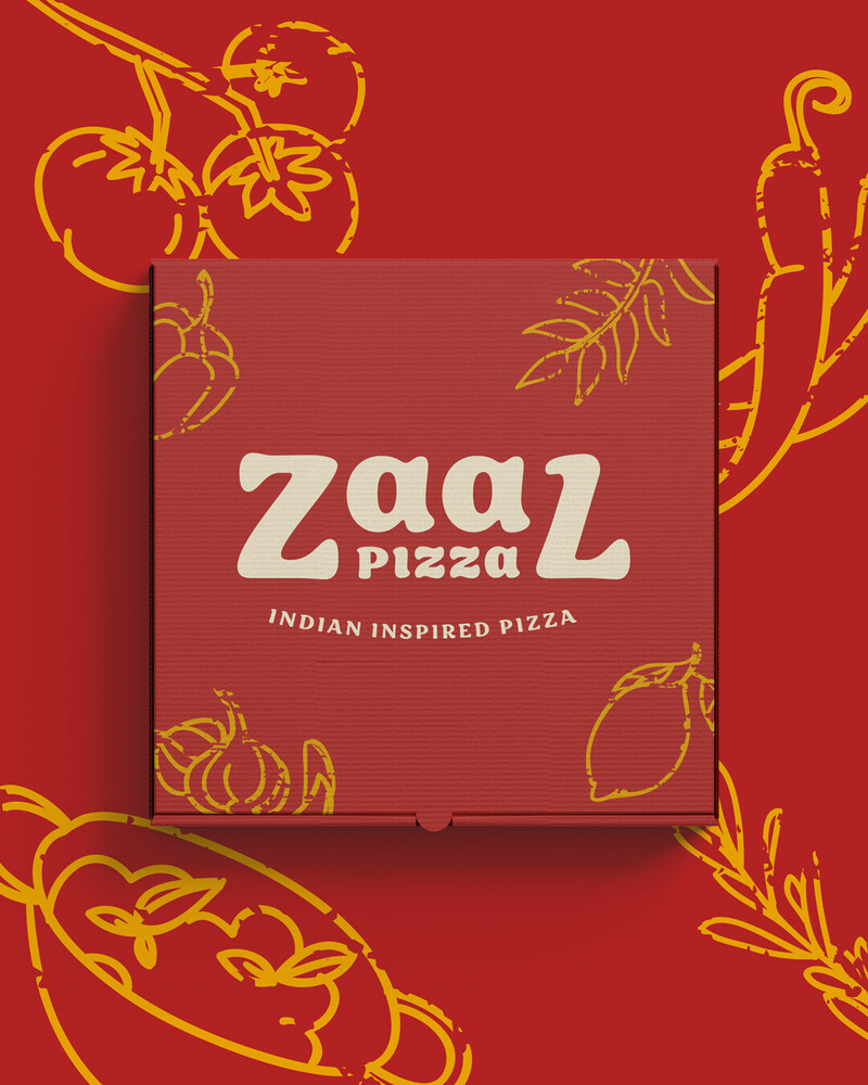
Image: Zaal pizza box redesign
Text: A serif-style font has been chosen for the design to retain the trustworthy image from the original logo. The new font's rounded edges give it a more friendly, handcrafted feel. This also complements the pizza theme, and the traditional cooking style used in Indian cuisine. The text has been manipulated to create an almost symmetrical design, with the word ‘pizza’ nestled within the company name to create a distinct logomark.
Icon: Since the logo design is primarily text-based, it has been enhanced with additional icon elements that feature images from Italian and Indian cuisine to further establish the brand identity. The traditional, hands-on cooking methods have been reflected in a rough and rustic style.
Colour: A rich, spicy red was chosen, reminiscent of tandoori masala and classic pizza sauce. A warm and vibrant gold has been used for the accent colour, inspired by turmeric and the crusts of pizza.
Did you miss previous designs?
Didn't you catch our logo designs from previous episodes? You can find them here: