The Apprentice logo challenge - s19 ep2 virtual pop star
7th February 2025
posted 7th February 2025
Episode 2 of The Apprentice didn’t disappoint, giving us its first branding task of the series! Every season delivers its fair share of questionable designs, and this episode was no different.
In this blog, we’ll take a closer look at the logos from The Apprentice Series 19, episode 2. Explaining this week's task, figuring out what went wrong, and then putting ourselves to the test with a quickfire redesign.
The Task
The teams had to create a virtual pop star for this week's task. Splitting into sub-groups, half had to create a character and branding. While the other had to create a hit song and music video.
Team 1 – Bami
Team 1 chose to create a Taylor Swift-inspired pop character called Bami. Wanting her to represent female empowerment and strength.
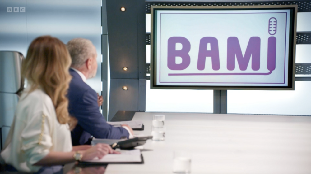
Image: Logo design for Bami
Text: For the text, they chose a simple sans serif font. Sans serif fonts are straightforward, simple, modern, and clean in style. This isn’t the best choice of font, as it gives a generic feel to the design. As a female empowerment pop star, this doesn’t showcase their individuality and how proud they are to be an advocate of this. It lacks uniqueness and personality. In the episode, it was mentioned that the logo gives off Barbie vibes. The plastic rigidness of the design combined with the pink does give this impression of a mass-produced doll. Which is the opposite of their character.
Colour: For the colour scheme, they chose a soft pink and purple gradient. Pink is a feminine colour; it has associations of playfulness, sweetness, compassion, and beauty. These are all positive things to be associated with as a female pop icon. The use of purple has associations with royalty, elegance, ambition, and spirituality. There are also great associations that strengthen the impression of being a leader in female empowerment. Both colour choices here were a good representation of what they were trying to achieve.
Icon: For the icon, they chose a microphone. This seemed like an afterthought and was a literal representation of a pop star. Using clear icons isn’t a negative thing, but in this instance, the logo is to represent the person rather than a business. It doesn’t represent female empowerment or embrace the uniqueness of the character. The design of the microphone itself isn’t great; it’s not clear to see that it is a microphone and could easily be mistaken for something else.
Team 1 - Redesign
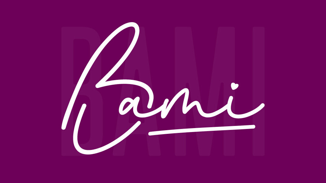
Image: Our redesign of Bami
Text: The logo is designed in a hand-written style font with soft rounded edges to give it a friendly, feminine appearance. The flowing text gives the impression that the logo was personally written, almost like a signature. The use of a signature style design gives an element of uniqueness to the design. It also gives a sense of power, like signing a document and making decisions.
Colour: Like in the episode, purple has been used as the primary colour. Although the colour has a feminine connotation, the deeper, stronger shade conveys a sense of empowerment and strength.
Icon: The letter 'B' is shaped like a love heart to represent the love and appreciation shown to fans while also providing the performer with a unique symbol. A small heart appears above the letter 'i' for added emphasis.
Logo 2 – Fred & Nadz
Team 2 chose to create a male and female rap hustler duo called Fred & Nadz. Focusing in on the daily grind, working and hustling to make money.
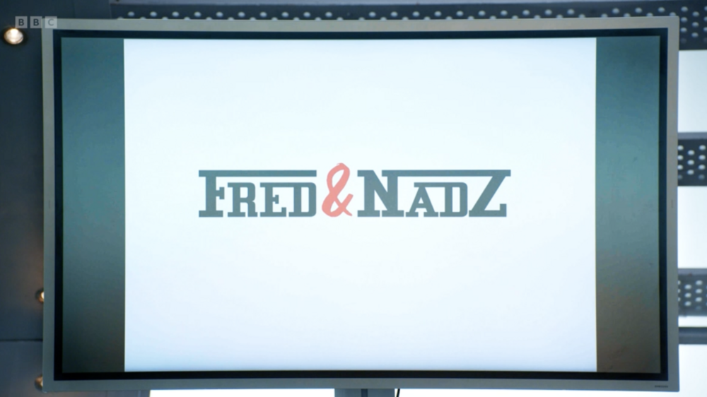
Image: Fred & Nadz logo
Text: For the text, they used a chunky slab serif font. Serif fonts are seen as traditional, confident, and bold. This isn’t the best choice to represent the duo. This gives the impression that the duo is traditional. The lines that stretch across the top add extra stiffness to the logo. Giving the impression that they are inflexible and don’t adapt to what life throws at them, which is the opposite of what they are trying to represent.
Colour: For the colours, they chose black and red. The use of black has associations of being bold, powerful, and dramatic. For representing a hustler duo, this gives the impression of being bold to get where you need to be and being a force in getting the change you want. Red has associations with energy, excitement, dynamism, and impulsiveness. Giving the impression of the fire in them to push where they need to be to achieve goals. The use of these colours was a great choice for the logo.
Team 2 - Redesign
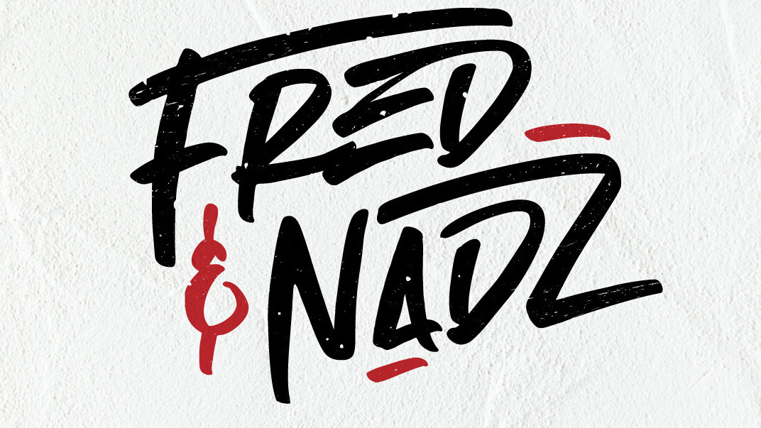
Image: Fred & Nadz redesign
Text: The original font choice the teams chose was stale and uninspiring. For the text, we’ve used a customised hand-drawn style font. This adds a bit more energy to the logo with its organic nature, giving a sense of creativity to the design. Using a hand-drawn style font shows individuality and represents the duo and genre much better. Showcasing that they are creative, unique, and bold and how they make their money. We've kept a similar concept of linking the letters but in a more fluid way.
Colours: We’ve used the same colours as the original logo. The colours are simple and bold. The strong use of black helps give that bold impact, and the touches of red add energy and vibrance.
Missed last year’s challenge?
Didn’t you catch our logo designs from last year? You can find them here: